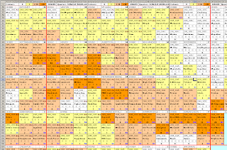
 This pentad chart was designed by Peter Spence as an aid to planning atlas trips. It is essentially a map showing pentads grouped by Quarter Degree Squares.
The nine pentads per QDS are surrounded by a dark black line for the boundary of the QDS, which is also equivalent to a 1:50 000 topographic map. The 1:50K map code is shown at the top left of this dark black box, with the name at the top centre and the club in whose area of responsibility the map falls on the top right [where M = Midlands, N = North, P = Port Natal, S= Sisonke, T= Trogons & Z = Zululand].
The dark red line is the degree boundary. In the illustrated example the whole of 2930 is shown.
The pentads are coloured according to how many cards have been returned. White pentads have no cover, yellow pentads one card, orange pentads 2 to 10 cards and dark orange pentads have more than ten cards returned.
In addition, the following data are displayed in each pentad:
- Pentad code in top left;
- If the pentad falls on any IBA or PA this is on the top right [IBA's higher priority than PA's];
- Pentad name in bold on the next line;
- The next line reflects the cards returned per quarter. The quarters read: SON :DJF:MAM:JJA. I did try to follow the seasons as best possible.
- The last line reflects the total number of cards for the pentad in bold black on the left, and the total species recorded in bold blue on the right.
These charts are generally updated on a weekly basis and can be downloaded from the links on the right.

No comments:
Post a Comment